Equaacademy
Taking gated content to the next level
Featured Project
Equaacademy:
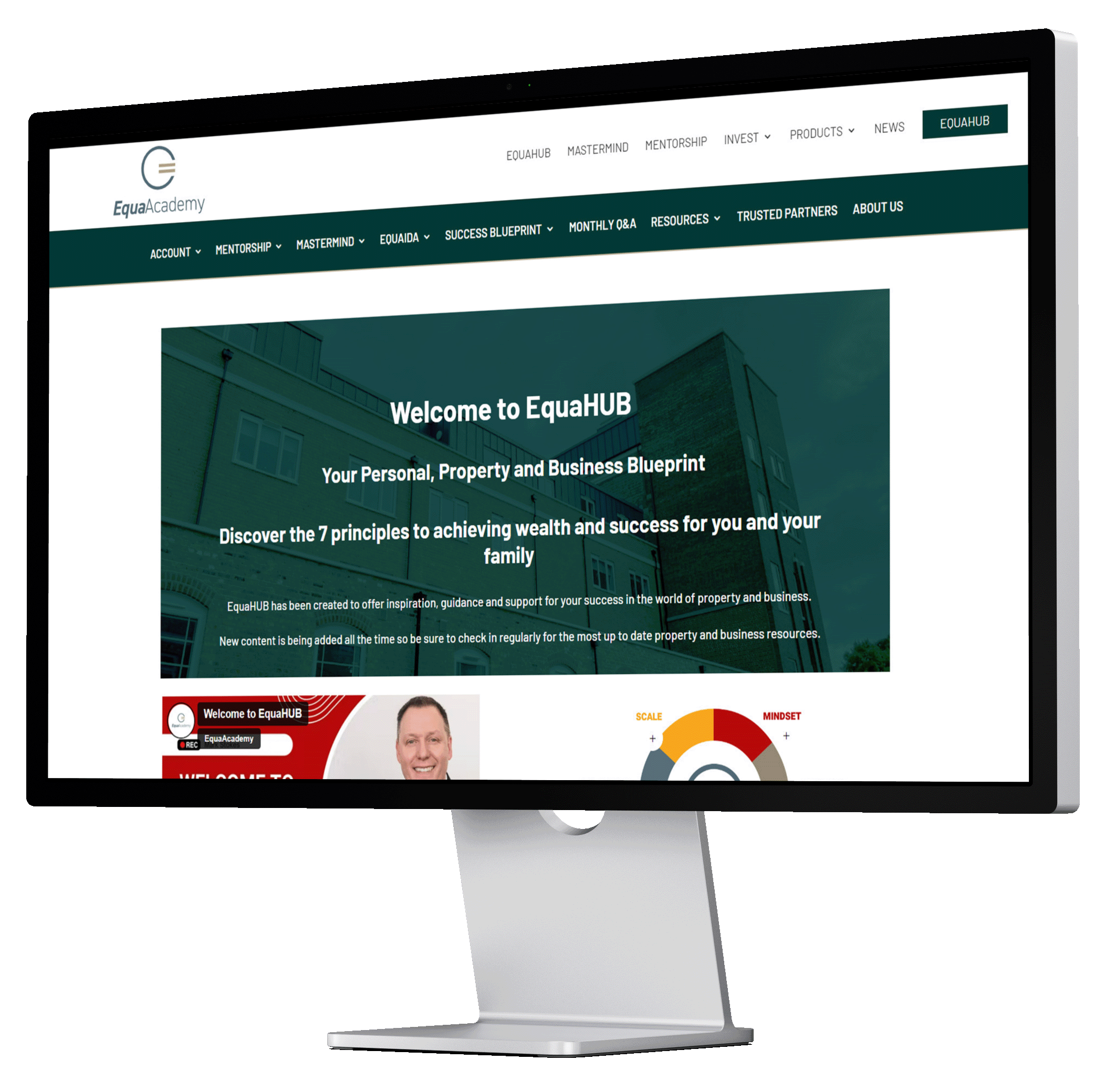
A complete redesign of their membership portal, EquaHub
In May 2022, property development training provider EquaAcademy approached us with an exciting brief. They wanted to upgrade their current membership portal, so that the design and functionality was easy to navigate and allowed portal members to benefit from their educational content and resources. In addition, they wanted to change the way memberships were recorded and payment details were stored.

The Challenge
Firstly, we had to establish exactly what it was that the client was looking for, and how we could help them to achieve this. We did this by working together with the client to hear their ideas and use our expertise to make recommendations. During these discussions, we were able to get a feel for the design and functionality they required from the new EquaHub. As a result of this, we identified the following challenges:
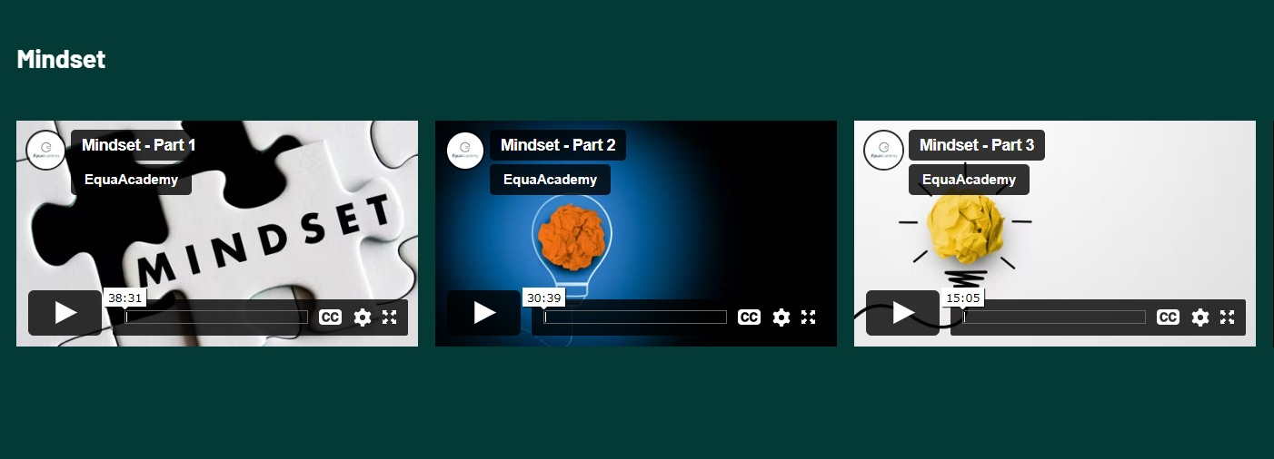
- The existing membership portal had a huge amount of educational content on it, including videos, presentations and PDFs. This would all need to be moved across to the new hub.
- The new hub needed to be designed with minimal disruption to the existing portal, so the client could still operate their business as usual
- It was vital that the new hub was visually appealing, easy to use, and that it was simple for new members to sign up and find content
- The membership structure had to accommodate multiple membership levels. These levels would all have access to varying degrees of content within the hub.
- The design needed to be interactive and engaging. It needed to lend itself to displaying content in multiple formats on desktop, mobile and tablet browsers.
The Solution
To overcome these challenges, we had to separate the task in to two key tasks: the design of the hub, and the changes to the membership software.
Website Design
Our first task was to create a development site which we could work on without interrupting the running of the live website. This enabled us to create a new portal design, a reinvented menu structure, and many different pages holding resources – all while the existing membership portal was undisturbed.
We started with the design of two home page templates: one for existing EquaPortal members and one for non-members. In order to get the design right, we looked to other membership focused website designs for inspiration. As well as other brand designs that the client had referenced in their initial brief.
Once we had approval from the client on this design, we were able to create templates for the other pages within the menu, and to format all the content from the existing portal so that it displayed correctly. It was important that the hub was easy to navigate and that the content the user was looking for was never more than a few clicks away. We managed this by creating a clear menu structure, adding anchor links to longer pages, and by separating content in to key categories.
Many of the websites that the client had used as inspiration made use of interactive design. We were keen to add this element to the hub design, and did so by utilising animation options within the Divi theme. We added these to certain image and text elements, to contrast with the non-animated sections and to make some key features of the website stand out.
Membership Portal Software
EquaAcademy had previously used Restrict Content Pro to create different membership levels for their clients, and to filter which portal content was available based on these levels. To make the membership process as simple as possible, we decided to research in to other membership plugins that may be more user friendly and intuitive.
Following some research, we discovered that MemberPress had everything that we needed to easily record membership levels and the details of members. It worked seamlessly with WordPress, enabling us to restrict content to the appropriate members, and set restricted content messages for members of different levels. MemberPress also worked well with the clients existing payment software, making payments easy to manage.
As well as this, MemberPress also made it easy to edit existing client data, so that if a member decided to change or cancel their membership at any time, this would not be an issue.
Once the design and membership elements of the new EquaHub were complete, the design was moved over to the live site. The client successfully launched the new hub, which they are hoping will attract many new members and make learning an enjoyable experience for existing members.


